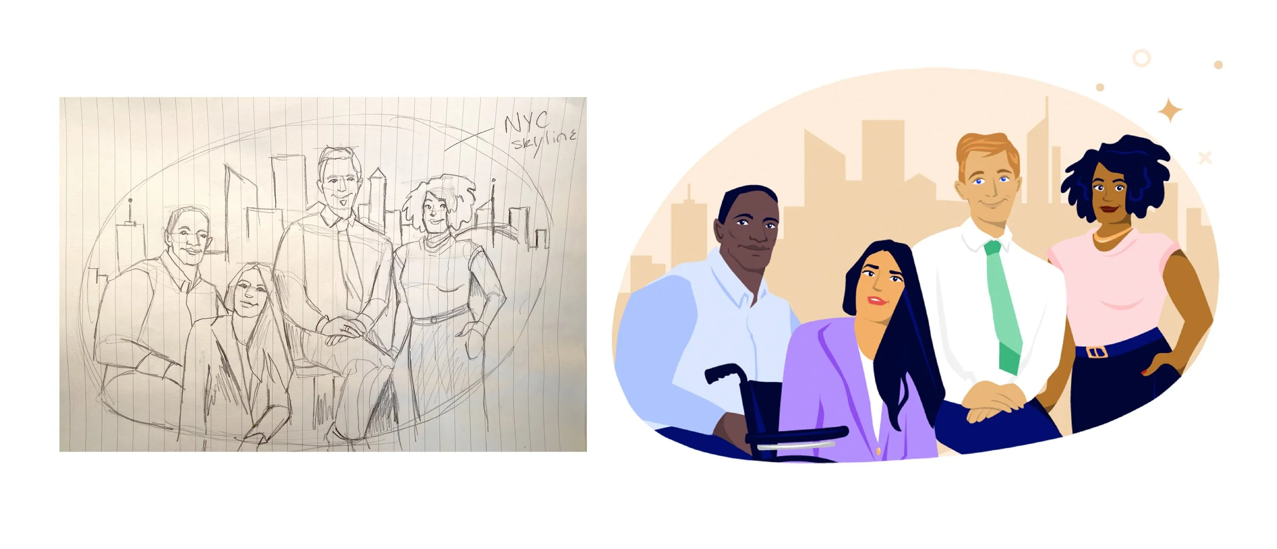
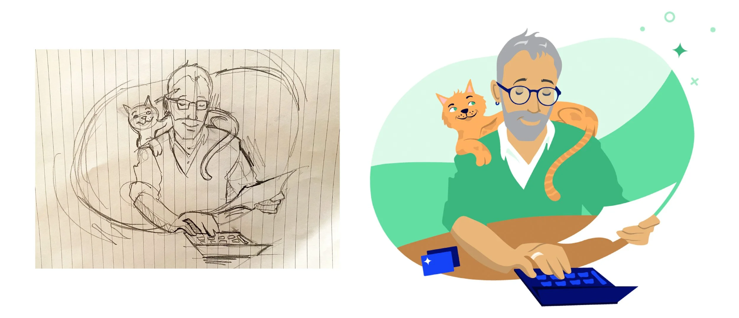
A collection of Illustrations designed for the CreditCards.com homepage. The goal was to add more unique and colorful graphics to the brand’s homepage where they had previously used stock illustration. I designed these illustrations for this About Us page refresh to reflect the diverse community of users who utilize the services from CreditCards.com.
Art Director: Riley Arthur
Role: Visual Designer, Illustrator
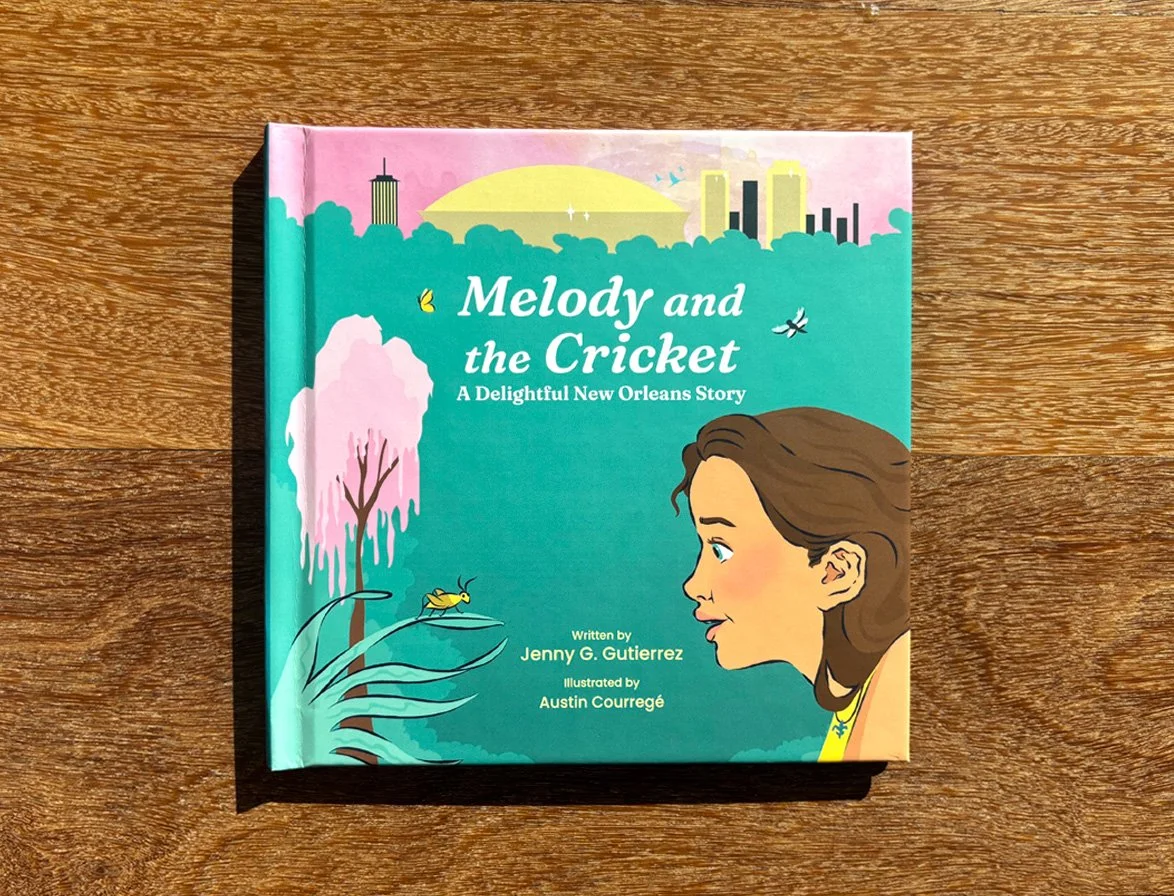
I designed and illustrated Melody and the Cricket in collaboration with author Jenny Gutierrez, connecting remotely between New York City and Eugene, Oregon. Growing up in New Orleans, we wanted the city to feel like a living, breathing character in the story, and ultimately chose the Bayou St. John neighborhood as our setting. While visiting New Orleans, I gathered reference images and created developmental sketches that would anchor the book’s visual world.
From there, I established a cohesive color identity, translated sketches into full illustrations, and edited and packaged the digital manuscript for print production. The book follows Melody, a curious young girl, as she discovers that life itself is the best classroom, guided by a little cricket friend. Every illustration aimed to make the city, nature, and Melody’s journey feel vibrant and accessible, encouraging young readers to see wonder in the everyday.
This project allowed me to combine storytelling, illustration, and design while learning through hands-on iteration, and gave me the chance to craft a visual world that felt both personal and immersive.
Role: Principle Designer and Illustrator
As a visual designer for Bankrate, I partnered with the editorial team to create a collection of illustrated infographics that lived alongside and elevated published content on the site. The challenge was to take complex or often clinical financial concepts and make them not only approachable, but also memorable—using humor, symbolism, and storytelling to engage readers in fresh ways.
My process included producing preliminary sketches, presenting concepts to editors for feedback, and finalizing illustrations in line with the publishing schedule. Each project was an opportunity to stretch creatively while sharpening my Adobe Illustrator skills and refining my output. This work became a playful but purposeful exercise in how thoughtful visuals can transform financial education into something relatable and impactful.
Role: Visual Designer
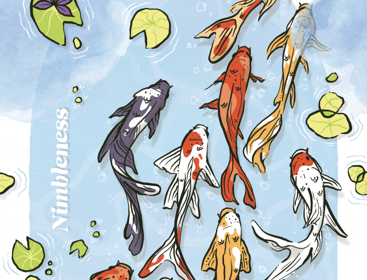
When Red Ventures invited a small group of nominated designers to create pillar designs for its corporate campus in Charlotte, I was honored to be selected to represent the core value of Nimbleness. My concept centered around the graceful movement of koi fish—symbols of adaptability and flow—drawing a connection between the natural world and the rhythm of professional life. By bringing elements of nature into the sleek, open-air auditorium, the design aimed to create a sense of balance and reflection within the space.
The process included developing preliminary sketches, refining the concept, and presenting it to stakeholders for feedback. Ultimately, I was able to share both the visual design and the story behind it on stage at Red Ventures’ All Employee Conference in Spring 2024. This project not only showcased my ability to translate abstract values into visual storytelling but also gave me the opportunity to represent design in a highly visible, company-wide forum.
Role: Visual Designer, Illustrator
In 2022, I was tasked with helping shape the visual identity for the inaugural Bankrate Awards, a high-profile editorial initiative celebrating the best in personal finance. My contributions included designing the official logo mark as well as developing a family of illustrations that brought energy, clarity, and a sense of celebration to the awards package.
The project required moving from preliminary sketches to refined drafts through collaborative refinement sessions with both design and editorial teams. The final system balanced a strong, trustworthy mark with playful illustration styles that made complex financial topics feel approachable and engaging.
As one of Bankrate’s most visible editorial collections of the year, the Awards design showcased how branding, illustration, and storytelling can work together to elevate content and create a consistent, celebratory experience across platforms.
Creative Director: Stephen Oster
Art Director: Riley Arthur
Role: Visual Designer, Illustrator
Final logo design
Logo secondary treatments
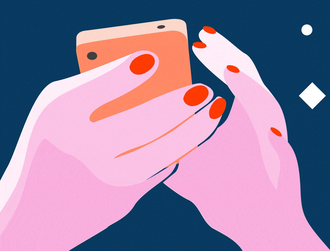
As part of my work with Bankrate’s editorial team, I created a large collection of digital collages designed to visually anchor and enrich published articles. These collages served as the primary visual entry point for readers, setting the tone for each story while aligning with Bankrate’s brand and audience.
Between 2023 and 2025, I produced more than 770 unique images—278 in 2023, 320 in 2024, and 175 in 2025. Each piece balanced storytelling with clear design, often weaving symbolism, texture, and visual metaphor into accessible, editorial-friendly compositions. Beyond sheer volume, the work was an exercise in consistency at scale, honing my ability to create engaging, high-quality imagery under tight publishing timelines.
In parallel, I incorporated AI research and the clear prompting of ChatGPT into my creative workflow. By experimenting with symbolic and conceptual prompts, I generated editorial collateral that pushed beyond surface-level imagery, introducing layered meaning and metaphor into financial storytelling. This integration allowed me to ideate faster, test variations efficiently, and build a visual vocabulary that combined human-crafted illustration with AI-informed concept development—ultimately expanding the breadth and depth of Bankrate’s editorial design.
Role: Visual Designer
“Selling a house to a family member”
“I was a victim of credit card fraud while traveling abroad”
“Are jumbo CDs even worth it today?”
“How much are points and miles worth in 2023?”
“How to maximize the AMEX trifecta”
“What to do when your spouse hides their finances”
“How to use the safe withdrawal rate (SWR) method”
“Average credit score to buy a house”
“What is the available balance in your bank account?”
“What is an appraisal waiver in real estate”
“How do I know if a financial therapist is right for me?”
“Guide to earning and redeeming frequent flyer miles”
“Why you should save online”
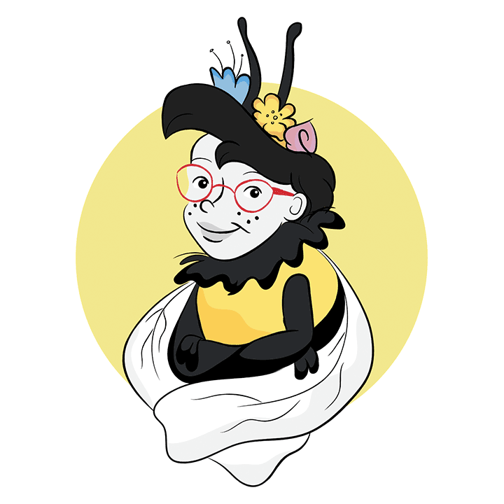
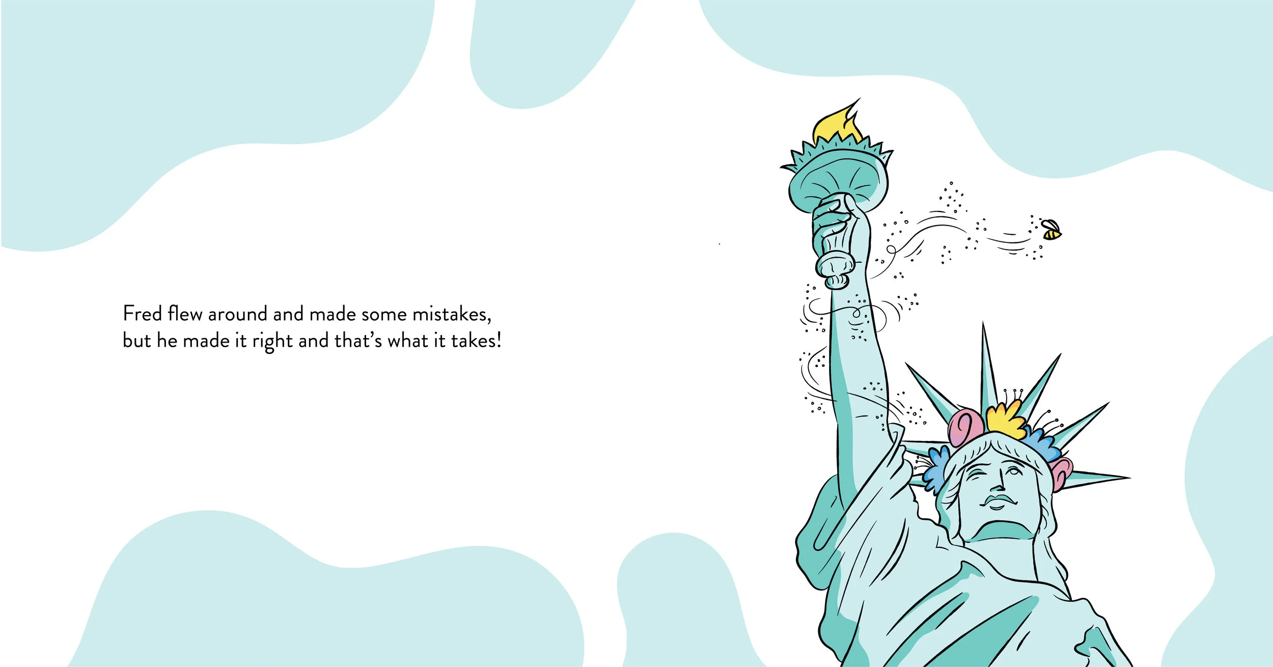
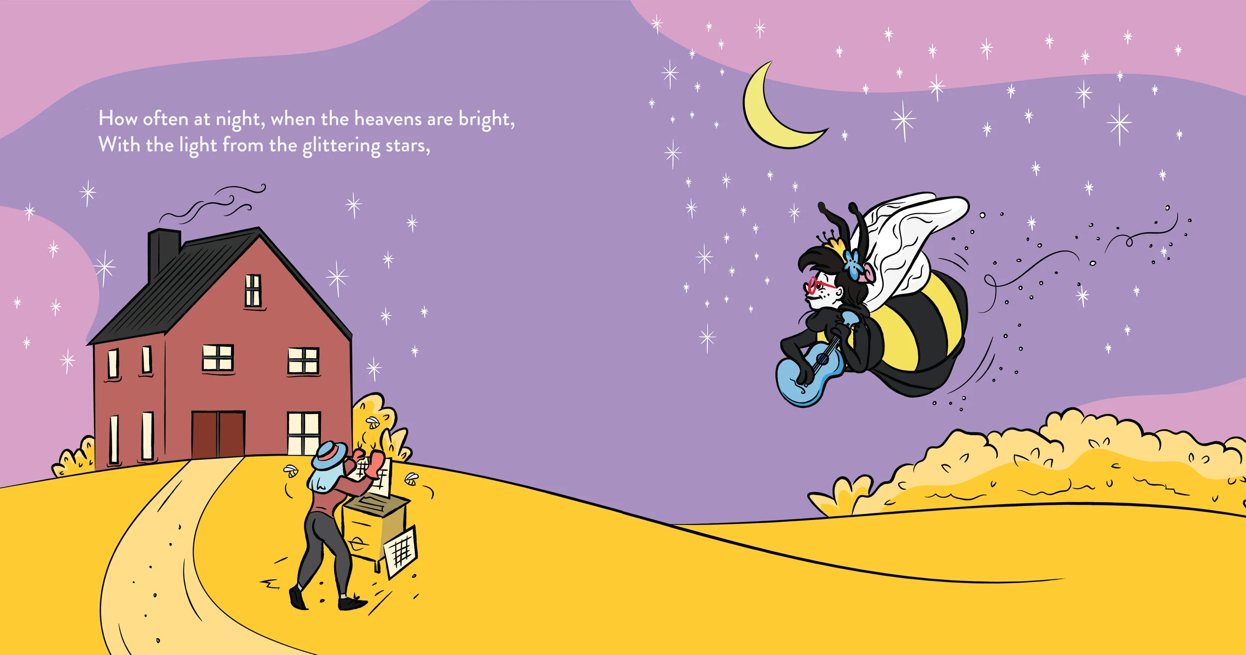
When author Kali Barnett approached me to illustrate and design her children’s book series, Fred the Bee, I was immediately excited to bring her vision to life. My role spanned creating a cohesive illustration style, establishing a typographic system, and leading the print production process to deliver the final book assets.
The series follows Fred, a curious bee whose adventures weave together playful storytelling with heartfelt themes. In the first book, Fred explores the New York City subway, discovers his love for music, and learns the power of forgiveness. The sequel, Fred the Bee Goes… Home on the Range, takes him on a road trip through Kansas, continuing the series’ mix of visual charm, humor, and gentle lessons.
This project challenged me to balance narrative-driven illustration with practical design systems, while also deepening my experience in book production from concept to print.
Role: Principle Designer, Illustrator
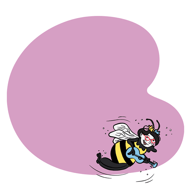
Fred the Bee Character Design
Fred the Bee Cover
Fred the Bee goes…Home on the Range Cover
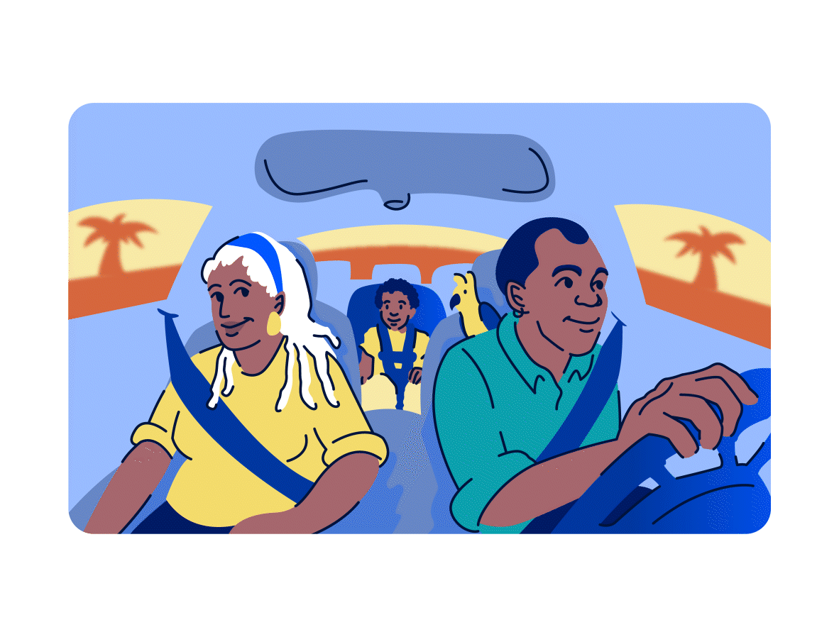
As part of Bankrate’s CardMatch tool, I was asked to design a collection of digital illustrations that would bring personality and warmth to the product experience. The goal was to create a series of card vignettes that depicted everyday scenarios where credit cards play a role—dining out, traveling, grocery shopping, and family responsibilities.
To achieve this, I developed a main character, Benny, along with his companion, a parakeet named Jet, who together carried the storytelling thread across each illustration. This approach not only gave the tool a recognizable and relatable visual identity, but also made the abstract world of credit card matching feel more approachable and human.
The project combined character design, narrative-driven illustration, and iteration to ensure consistency across multiple use cases. The end result was a playful yet purposeful visual system that helped users see themselves reflected in the everyday choices represented through CardMatch.
Role: Visual Designer, Illustrator
A collection of digital illustrations and collages I’ve designed for editorial publications.
Role: Designer, Illustrator
“If Timothée Chalamet Were A Russian Spy”, Bustle
“How 10 Women Of Color Actually Feel About Working In Book Publishing”, Bustle
“How These 4 LGBTQIA+ Leaders Are Changing the Travel and Aviation Industry” - Brian Gambino , The Points Guy
“How These 4 LGBTQIA+ Leaders Are Changing the Travel and Aviation Industry” - Kimahli Powell, The Points Guy
“How These 4 LGBTQIA+ Leaders Are Changing the Travel and Aviation Industry” - Jessica Taylor, The Points Guy
“How These 4 LGBTQIA+ Leaders Are Changing the Travel and Aviation Industry” - Jamie Windust, The Points Guy
“What Valentine’s Day Means When You’re Asexual & Aromantic”, Bustle
“Things I've Searched About My Vagina”, Bustle
“In An Era Of Body Positivity And Inclusion, Why Are We Still Screwed Up About Feet?”, Bustle
“The Existential Depression That Arrives After Baby, Or In Childhood, Or Hides In Plain Sight”, Romper
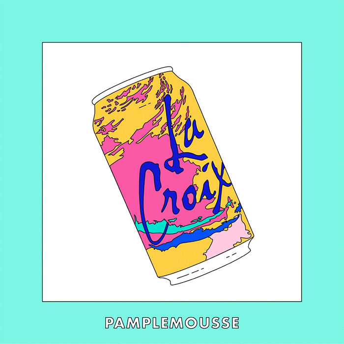
“La Croix branded illustration”, Bustle
“Digital Collage”, Bustle
“Digital Collage”, Bustle
“Digital Collage”, Bustle
“Digital Collage”, Bustle
Illustrated Robin Arzon’s favorite running routes in New York City for Adidas-sponsored content on Bustle. Translated real-world paths into clear, engaging visuals that complemented photography and guided readers through each route, blending storytelling, mapping, and playful illustration to bring the experience to life.
Photographer: Joshua Pestka
Editor: Erin Kelly
Role: Designer, Illustrator
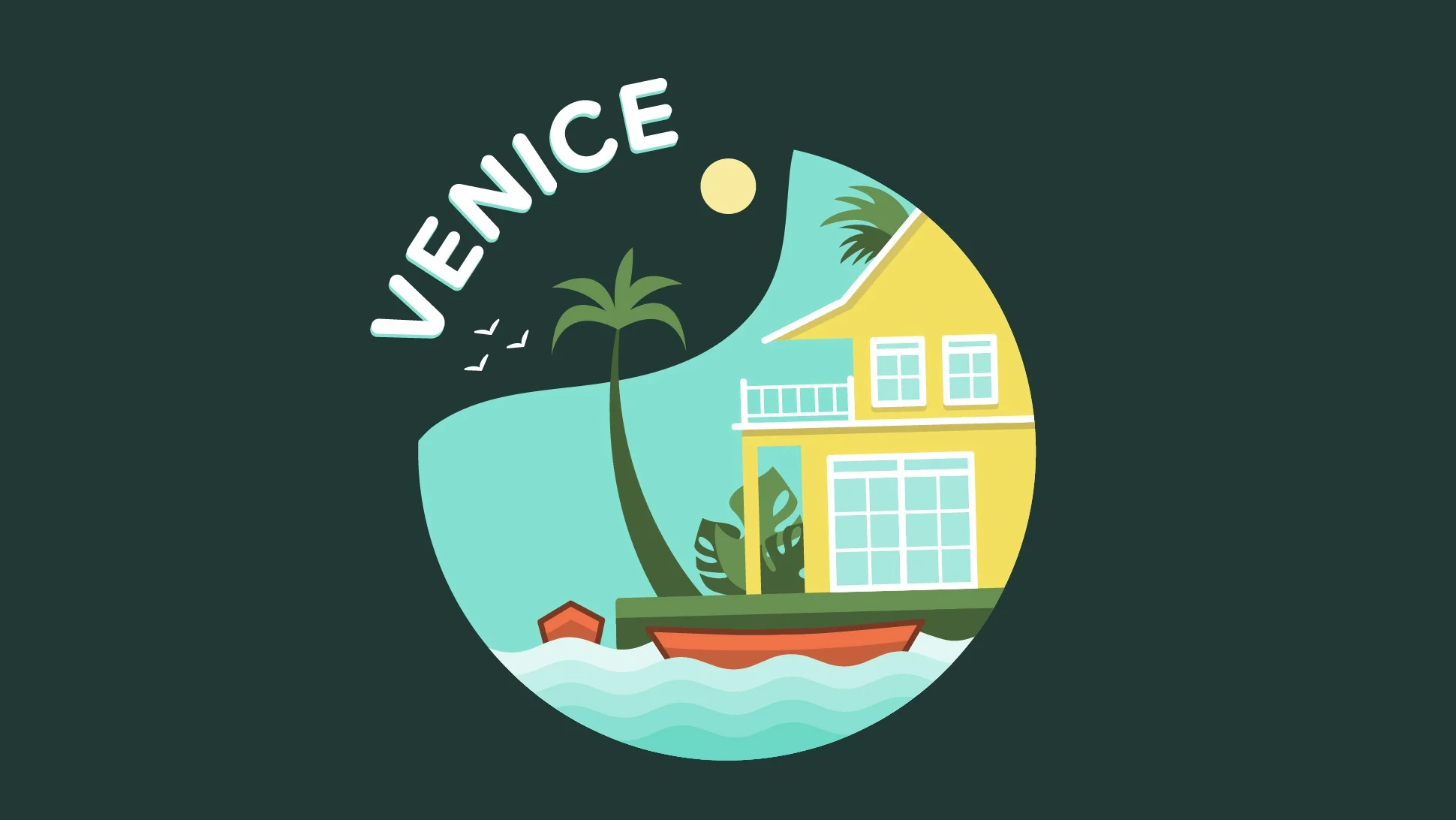
As a designer for Snapchat, I created community-specific geofilters that reflected the unique character of each location. The challenge was to design assets that felt playful, engaging, and instantly recognizable, while remaining functional within the constraints of Snapchat’s platform.
My process included researching each community, producing sketches and concepts, iterating based on feedback, and finalizing illustrations for activation. As of April 2021, I designed 31 geofilters, with 27 activated—collectively used 8.8 million times and viewed 593.4 million times. Each project was an opportunity to experiment with illustration, visual storytelling, and contextual design, ensuring that a simple geotag could feel both personal and impactful.
Role: Designer, Illustrator
Designed Instagram story series intros for content through Bustle Digital Group.
Role: Designer and Illustrator
“Grocery Diaries”
Design and animation for an Instagram Story series for Romper. The series focused on millennial mothers and they’re grocery shopping habits.
“Take Care”
Design and animation for an Instagram Story series for Bustle Uk. The series focuses on the self-care regimens of diverse, millennial women with a different host every episode.
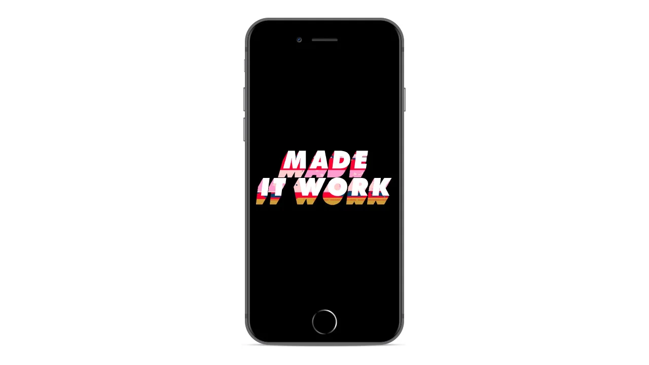
“Made It Work”
Proposed intro for an Instagram series for Bustle UK. The series focuses on the daily work lives and morning routines of different career women.